Is the logo of the NU School of Sciences is better than NU School of Humanities?
- Almira Zhantuyakova

- Jan 20, 2019
- 7 min read
Updated: Feb 10, 2019
Nazarbayev University (NU) is an autonomous research university in Astana (Kazakhstan). Founded as a result of the initiative of the President of Kazakhstan, Nursultan Nazarbayev in 2010. Even though NU is only 9 years old, it has already established eight schools. So, the topic of today’s blog is the analysis of four of these NU School logos:
One could find all the school logos on the right side of the entrance to NU from the Turan street (just near Kunde Café). Below you can see flags with all the logos in their glance placed in flags hanging side by side.

Employing concept of semiotics from the book "Visual Culture", we will analyze their design elements of the school logos and try to understand what message schools try to convey about themselves. Based on the analysis, I will provide my ranking of these school logos . Next, using concepts in the book "Universal Principles of Design" by William Lidwell and Kritina Holden, we will also provide some ways for improvement of the design of these logos.
Semiotics is the study of signs and their use or interpretation. Semiotics concerns with the relationship between 'sign', 'signifier' and 'signified'. Richard Howells and Joaquim Negreiros describes 'signifier' as something that stands for something else and 'signified' is the idea of the thing it 'signifier' for. The union of these two creates the 'sign'. However, the resulting sign may go further and signify something further, which is termed as 'myth'.
The signs have three main modes icons, symbols and indexes. Icons directly resembles the signified. Indexes are connected in logical wy to signified. The trickiest one are symbols, which resembles the casual relationship with the signified that inherently connects symbols with a particular signified. To know more about the modes of signs, I advice you to watch the video in the link.
Common Features
Comparison - "the method of illustrating mlationships and patterns in system behaviors by representing two or more system variables in a controlled way." ("Universal Principles of Design")
Consistency - "the usability of a system is improved when similar parts are expressed in similar ways."("Universal Principles of Design")

First, all these school logos are incorporated into flag. We perceive flags as symbols, which inherently connected to the thing it refers to and is matter of convention in particular society (in our case Kazakhstan). Saying that flags can be easily misunderstood… The flags have common features:
1) Shape of the flag
2) The general layout of the flag
3) NU logo on each flag
4) Kazakh cultural ornaments
5) Strip at the bottom with different colors for each school
These similar features employ the comparison and consistency principles of design, where the common features: makes viewer to understand that these objects are related, as these are part of one university; makes it easier to catch the differences and compare the logos.
The flag is in the form of arrow, which might signify the same direction of development of the university and schools. The signifiers at the top and bottom are the symbols of Kazakhstan and Kazakh culture, which are the signified of the cultural heritage, and could demystify university as the representation of Kazakhstan. While the strip at the bottom of the flags tries to differentiate the schools even further, which I feel excessive and breaks the overall aesthetics.
Let us now stop by each of the four flags…
SoM Logo
Archytypes- "universal patterns of theme and form resulting from innate biases or dispositions." ("Universal Principles of Design")
Exposure effect - "repeated exposure to stimuli for which people have neutral feelings will increase the likeability of the stimuli. " ("Universal Principles of Design")
Framing - "a technique that influences decision making and judgment by manipulating the way information is presented." ("Universal Principles of Design")

First what come to eyes is the color choice of the SoM logo. The dirty orange contrasts what we associate with medicine such as sterility and cleaness. Because of the bold black words on the dirty orange background, the logo looks very crowded and unpleasant to look at.
Th word "NUSOM" is the abreviation of name of the school, which seems to be reduntant, since the full name of the school is aleady present in logo 3 times... This is the inappropriate use of exposure effect.
Additionally, the words on the logo, does not really represent the aims of the school as a medical school. The "excellence in research and education" may refer to any discipline/ school. That could be a slogan and rememberable to this particular medical school something that has a positive framing and could lead to exposure effect.
The two symbols on the logo the of the SoM, laying 180 degrees away from each other, are signature Kazakh ornaments. These symbolizes the values of school are in context of Kazakh heritage.
The depiction of snake winding around a vessel is the Bowl of Hygieia, which is the symbol of pharmacy in Greek mythology… these symbols tend to be utilized by the pharmacy stores and pharmaceutical societies. Below you can view the examples of typical pharmacy logos featuring the Bowl of Hygieia.
Even though it has some relation to medicine, it does not directly refer to medical profession. Here we can see the inappropriate usage of archetypes. There are more appropriate symbols such as caduceus.
SST Logo
Iconic Representation- "the use of pictorial images to improve the recognition and recall of signs and controls." ("Universal Principles of Design")

First, I would like to point out that there is not abbreviation of SST on the logo in additiona to the twice stated full name of the school. In this case the exposure effect in contrast evokes more negative feelings, as the repeatedly exposed stimuli is boring.
The two symbols on the logo the of the SST, laying on opposite sides of the logo, are signature Kazakh ornaments. They signify the velues of the school in context of Kazakh heritage.
Two aspects of the school is the science and technology. In the middle we can see the gear as an iconnic representation of technology. Pacticularly the gear is iconic representation, as it is commonly used / associated with a mechanism part.
The line orbiting around gear seem, in my view, to mimick the simplified atomic structure. While the simlified atomic structure widely accepted as an arbitrary representation for science.
Interestingly the gear is inside of orange circle with 32 tear shaped figures around, which based on closure tendency perceived as the sun. This arbitrary symbol came from the flag of Kazakhstan and represents Kazakhstan.
The gear inside the sun and overall the atomic symbol encompassing it, represents mission and values of the school. It seems that the mission of the school is to develop science and technology within Kazakhstan and to establish it on international science and technology arena.
GSPP
"...desaturated,dark colors are perceived as serious and professional..." ("Universal Principles of Design")

The color choice is quite good, this brown color gives more professional and even serious look to the logo, which indeed pertains political sciences.
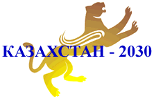
In the back one can see a mystical animal looking like a weirdly standing puma with wings. This mystical animal is also the cultural sign of Kazakhstan. This is not a depiction of puma, but snow leopard, which was an object of worship of ancient Kazakhs. The golden depictions of the mystical animal were found on the clothes of the Golden Man (a warrior's costume from about the 5th century BC). Having the literacy on Kazakh culture and history, we can assume that the snow leopard is demystified as symbol of governance and wisdom. This depiction can also be found on the political strategies of Kazakhstani government for 2030 and 2050, which might also signify the compliance of the GSPP with the strategies. Additionally, the two symbols on the logo the of the GSPP, laying on opposite sides of the logo, are signature Kazakh ornaments. They signify the velues of the school in context of Kazakh heritage.
In additional to the twice stated full name of the school, you can see the school name abbreviation This in this case is more aesthetically looking than in previos logos due to color contrast(brown and white) and big font bold size. In this case the exposure effect might evoke a greater likeability. Additionally, the "Good Government Matters" isounds like a slogan particularly pertaining to school of plitical sciences and rememberable to this particular medical school something that has a positive framing and could lead to exposure effect.
SHSS
Entry point- a point of physical or attentional entry into a design.

The color choice is inefficient in this logo. Thin dark red words on the black background hinders the reading. The black and dark red colors gives a feeling of tragedy and horror than a schoo logo. The names of the departments just in the word cloud looks unprofessional. I would suggest instead of names of the departments use the logos associated with each department to show that SHSS encompasses the whole list of sciences.
We can also see the traditional two symbols of signature Kazakh ornaments laying on opposite sides of the logo of SHSS. They signify the velues of the school in context of Kazakh heritage.
At first glance, the logo does not look attractive and appealing comparing to others. This means that the entry point is ineffective particularly having enhanced barriers, not clear points of prospects and no progressive lures.
One of the barriers is crouded background. The noisy background with many seemingly unnecessary elements impedes people from moving through the entry point. In terms of points of prospects, the contrasting word "SHSS" does not really orient people. Additionally, the person may become lost in the cloud of words behind and distracted. The absence of progressive lures hinders people from going deeper than the entry point. The progressive lures could be implemented by using memorable and self describing slogan of the school.

The only symbol here I can think of is just the collection of words, which can convey the unapproproate message as an educational unit. I get a sense that SHSS is the collection of words, with no clear/ deep connection between them. In this case, repeated statement of schools name and its abbreviation just on the middle emphasizes the careless approach to designing the logo and evokes negative attitude and feelings.
In Sum
We have deciphered the logos of four NU schools, we can see that some of the design elements may make us think negatively of the school, but some may elevate our inerest. As I promised here is my rank of the four school logos based on the analysis provided above:
1. SST
2. GSPP
3. SoM
4. SHSS
Share your rank in the comments section below :)
References:
Book: "Visual Culture" by Richard Howells and Joaquim Negreiros , Chapters Iconology & Form (p.133 - 136) .
Book: "Universal Principals of Design" by William Lidwell, Kritina Holden and Jill Butler (p. 18- 202).


Comments